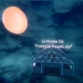
Le Musée de "Prototype Assets.zip"
A museum dedicated to as many assets from the Prototype Assets zip folder as I could get in there. There is no objective other than to observe. Also if you speak French, I am so sorry.
WASD to move, Mouse to Look Around (once the opening message is complete)
Transcript of Opening Message:
Bienvenue au Musée de Prototype Asset . Zip
Congratulations on making a game out of the provided assets, and I hope you are enjoying how others interpreted and deployed them in their own works.
Rather than make a game, I wanted to honour this strange collection of assets by displaying them in a museum.
Every effort was made to present these works as intended by their authors.
I do hope you enjoy.
Music:
Canon in D Major by Kevin MacLeod
Link: https://incompetech.filmmusic.io/song/3473-canon-in-d-major
License: http://creativecommons.org/licenses/by/4.0/
Known Issues: The Man on the toilet's clothes and skin shaders are often see through. Clicking on the shaders in the editor would resolve the issue, but that would reset on reloading the project, and annoyingly the issue remains in the build. Still looking into a fix.
Li'l Postmortem: This was obviously thrown together even faster than previous games, and so I went for something fun but achievable. I got to make a semi-functional first person controller, and it was fun to lay out the space and figure out how to fit everything in, along with how much personal spin I put on each object.
That said, I really only had a day to do this in so if things seem rushed or sparse, then yep! Taking this further would obviously mean having to drop the framing device, but I still think a museum for a random assortment of game objects has legs, especially if there were interactions with those game objects to make the museum a large, incoherent puzzle room. Cosmo D's The Norwood Suite was definitely an inspiration, and this taken further would likely end up with a similar structure to that game.

Comments
Log in with itch.io to leave a comment.
This was such a cool use of the assets, putting them all together like this into a museum. It was a lot of fun just like seeing all the assets as they should be used and looking at them like "ohh that's how they were meant to me used" because for a lot of my project, I felt like I was throwing in whatever assets just looked fun. Very creative idea, it felt like I was at like the MET for a Ripley's Believe it or Not. I don't have too much critique because if anything it's more of an interactive experience than a game, but it was fun seeing the execution!
The museum had a really nice atmosphere. The lighting was done very beautifully. My quick critique is that since this is in a game format, I feel like you could make the exhibits more interactive, like maybe a button to activate the explosion animation or have the fish swimming around the museum. I say this because what got my attention the most was the Toilet Lad's eyes following me as I moved around. Just that minimal amount of interaction already made the Toilet Lad infinitely more interesting to look at in my opinion.
It's a very nice curated museum! The lightings, the back ground music, the placements of the assets, etc., all makes this tour very immersive and different.I especially like the trees, standing and walking among them feels very nice, with some supplimental light sources, and how the skyboxes are presented is very creative and interesting,it gets me thinking about what an actual cyber museum could be. Nice museum.
This was great! I was a bit worried that a museum might be a boring way of displaying the assets, but this was actually very good! I loved the intro, it was a great introduction that I think was very needed. The music was perfect for the setting. I love how you combined or modified the assets to actually look like art! The lighting in this is also incredible. I would've toned down the Chromatic Aberration a bit, because it can be kinda hard to see things. I also wish you had included the sounds in some way, but the huge flowing wall of the text files was great too. Your Headless statue was also fantastic. I think everyone was having trouble with the meshes being inverted, but somehow it worked in your scene. Great job!
Oh my god this is so good and creative! I'm actually obsessed. You did such a great job turning the random pack of assets in to a cohesive whole and making a satisfying experience. It's fun to walk around and see how everything is displayed. I love Etheral Sprite. I love the faces constantly switching. I love the headless man with eyes that follow you around the museum. As mandated by the class, my one critique is that the mouse sensitivity is a bit high for my preference, but I also know that WebGL messes sensitivity up so I'm not bothered by it too much. Again, I cannot stress enough how much i love this, great job!
aksjhdfgkjahdgj I love this so much tbh. When you described it to me irl I was like "eh yeah" but playing it now im like "EY YEAH." This is like the epitome of mocking and celebrating found objects in the best way. i guess all of our games are, but this is almost a direct interaction with the concept in a great way. I love the voice modulation in the beginning. I think there should be more beatboxing in this game with my voice. Otherwise it's great. Oh there should also be raycasts.